I want to welcome you to the all new “retracked” version of We Were Inverted. No, I didn’t call in Rocky Mountain Construction (RMC) or Great Coasters International (GCI) to work on the site. I did it all by myself. Yup, this was an in-house job and I love how the site looks and operates more so than ever before.
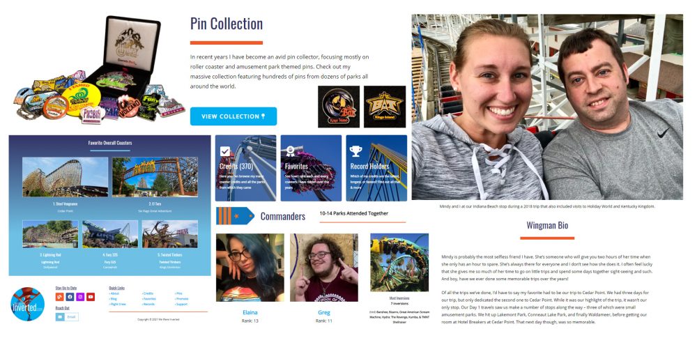
Depending on whether you came to this blog through the site itself or an outside link, such as Facebook, you may have already noticed some of these changes. The graphic above is a collage of some of these elements. My main goal here was to make the site work seamlessly on desktop, tablet, and mobile formats. I was always happy with how the site looked on desktop and tablet for the most part. On mobile, however, not so much. Knowing the large number of people who visit the site do so via their phone, I had to make some improvements. I also used this opportunity to freshen up the graphics and add/delete some other items. Some of the more notable elements include:
Home Page
Gone is the Intimidator 305 cutout and Storm Runner quote. While I loved the both of them, I felt it made the Home page feel empty. Replacing those is a nice vibrant photo of Fahrenheit that goes along with the site’s orange and blue color scheme. Under that are blurbs about some of the key sections of this site such as: Coaster – Credits, Favorites, Record Holders, my Pin Collection, and several recent blogs.

Pin Collection
My Pin Collection is one of the most updated portions of this site. I’ve had a number of pin collectors and coaster enthusiast comment how much they love the collection. With this redesign, I wanted to make that page more prominent. For this reason, you will now see “Pins” on the header bar as its own link, instead of being included under “Coasters,” as it was previously. There is also the teaser and button for the page featured predominately on the home page.
Flight Crew
More changes were made to the Flight Crew portion of this site than any other. Each member’s page has been streamlined. Gone are the bucket lists and favorite memories. In their place, photos like the one above (right) of Mindy and I have been added to all the wingman bios as well as to their favorites listing. At the bottom of each crew member’s page, recent blogs featuring that crew member have been added. Lastly, the header bar sees the return of all the crew members pages being listed in a drop down menu. The Flight Crew page showcasing everyone still exists and has also been revamped into a cleaner design.
Favorites
When I decided to feature every single roller coaster I’ve ridden in my Favorites listings instead of just a Top 50 or Top 25, the drop down menus became too cumbersome. The overall portion features 370 coasters alone at the time of this blog. Things needed to be changed. Now, under each category, you will see tabs that show the coasters in groups of 50. For example: Coasters 1-50, 51-100, 101-150, etc. I think this will help keep the drop down less overwhelming than having them all in one. In addition to the tabs, photos of the Top 5 Coasters for each category have been added to enhance the pages (Top 3 on mobile). An example of this can be found in the blue gradient box on the left side of the collage above.
Let me know what you think of all these changes. Do they make viewing the site easier or do you find things to be more organized? Are there improvements that you think would make things even better? How about any issues you ran across? I’m sure something was bound to slip by. No matter what you think, please let me know your thoughts and how you were viewing the site (ex. desktop, tablet, or mobile). It will give me a better glimpse into future changes of We Were Inverted. Thank you!


